I cannot begin this blog without first saying, “Thank you Pelmorex Media Inc.!”. Thank you for being above and beyond gracious hosts to the Web Design 2015 class.
You are probably wondering who “Pelmorex Media Inc.” is, not to worry I did not learn about who they were until our trip to “The Weather Network”. “Pelmorex Media Inc.” is a Canadian broadcast group and it is the parent company of “The Weather Network” as well as its French sister station, “Meteo Media”. They offer a full range of weather-related products, services and multimedia applications to a number of consumer and commercial clients. Above all, they employ a group of awesome individuals.
Not only did I enjoy learning about the process behind the user experience and interface design, but also the interest each team member of Pelmorex Media Inc. took in the students. I would say the highlight of the trip was not only doing the weather report on camera (which I was dreading to do!) but the lunchtime we spent with the team. It was really nice to have the opportunity to sit with the Pelmorex team and just chat. It did not feel like a one-sided conversation, there was dialogue and the team showed interest in who we were and how we were doing in school. This part of the trip spent with the team, personally, was most memorable. It is so evident how well Pelmorex Media Inc. works as a team.
In the first segment of the trip, Pelmorex Media Inc. presented to our class the core information about the company, aside from it being a weather reporting news station. The team organized a thorough presentation about the design, which was broken down into different teams’ responsibilities/jobs. Each team presented their work and process that they are responsible for, in terms of designing interfaces for “The Weather Network” website, tablet and mobile platform. This also involves the process of being functional for end users.
From all of the information driven presentations, what stood out to me the most was the one-person team working on the mobile application called “Beat the Traffic”. The main purpose of this app is to provide its users with current traffic information and updates. This app keeps its users aware of the roads they should avoid due to traffic or incidents’. As a class we were presented the various changes that took place in the app development such as, the app name and its interface developing designs. We were also presented with the teams’ continuous process of maintaining fixes and debugging of the app functionality in order to keep it user-friendly. The work done behind the app was captivating and I liked seeing how much further designing for various platforms could stretch out to. This presentation taught me how I could potentially branch out in terms of interactive/web design. I witnessed the work of applying web design into app development, which was significant to me. The significance of this presentation showed me that if I show willingness to learn further then I can and will do so.
The second segment of our trip at “The Weather Network” consisted of tracking and recording user experiences. We got a first hand experience of being test subjects in using “The Weather Network” application interface. We were instructed to find certain pieces of weather information, while doing so we had to talk through the steps to show how we got to the results. It was quite entertaining too to hear some of the confusion classmates ran into. The idea behind this process is not to feel like decisions made are wrong or right, but to tell the designers and developers what they need to work on in order to release a more user-friendly website/application.
It is one thing to read the book, “Don’t Make Me Think” by Steve Krug, but it is another thing when you actually act out and experience the information read. This was really informative and very helpful.
Furthermore, we were split into teams and given computers and asked to work together. The instruction was to arrange different words into columns and figure out which words related to one another, such as, “Last 24 Hours”, “7 Days”, “14 Day Trend” etc. After we arranged the words into the appropriate columns we needed to name each as a category like, “Maps”, “Trending”, “Current Weather” etc. The program we were introduced to, and I cannot forget to mention the excitement it caused Gillian, was called “Optimal Workshop”. This was a really neat tool used for arranging information also known as information architecture. This was really neat and I liked the fact that rather than telling us the information, the Pelmorex Media Inc. team actually immersed us in the information and data. I enjoyed the interactive part of the trip at The Weather Network.
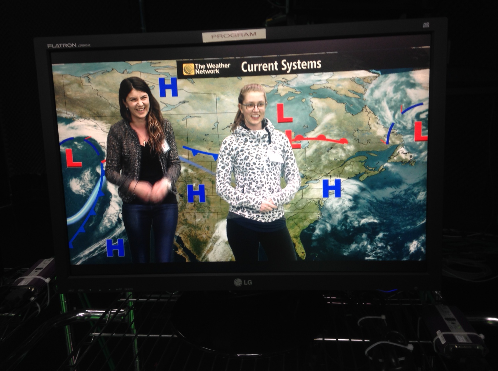
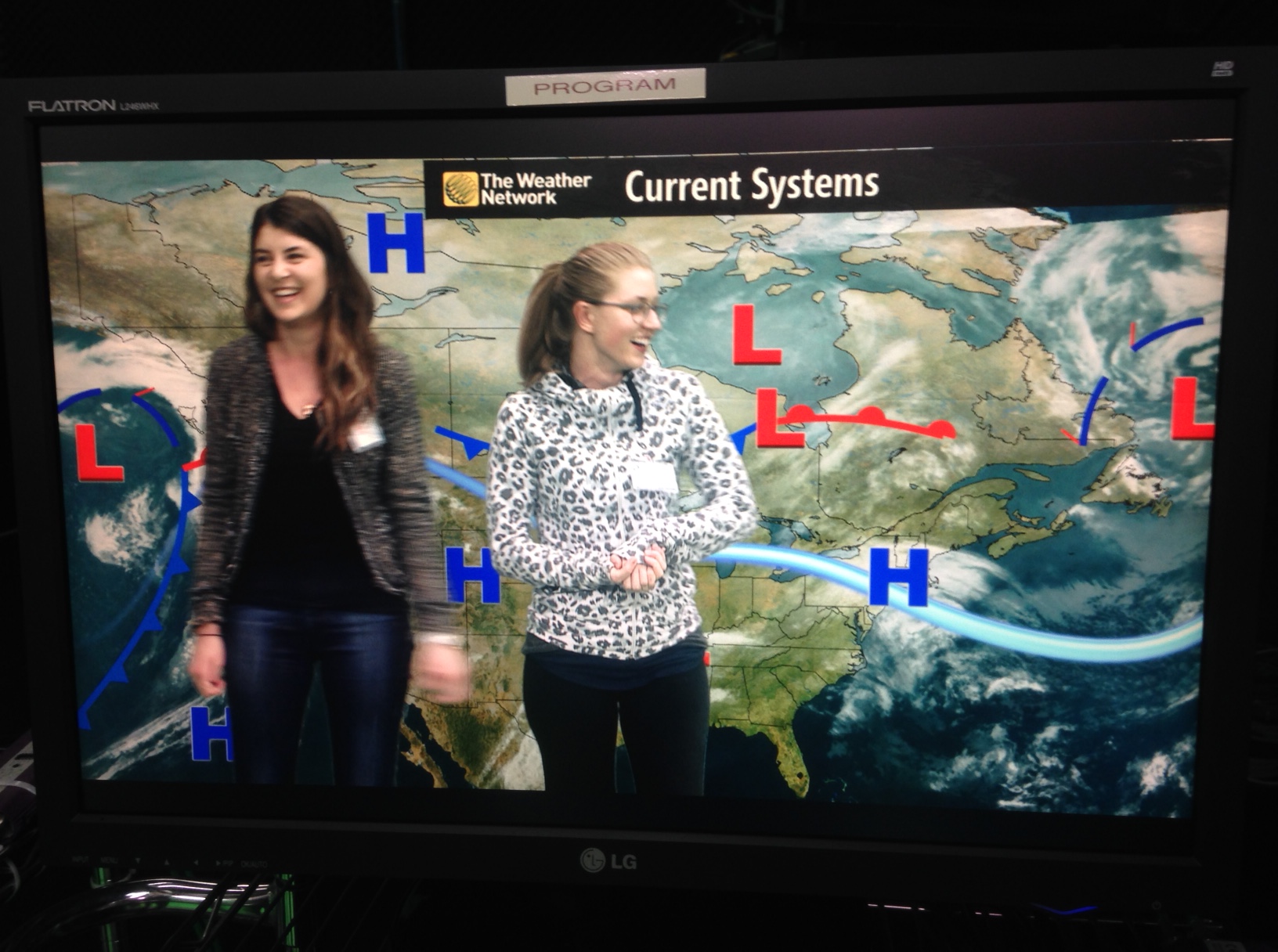
After all of the activities and presentations, we were taken on a tour of the station. We watched a video about the way the information is passed around before being aired on television. The technical difficulties were quite entertaining. Along the tour, we were taken into the green screen room and got a taste of what live broadcasting is really like. We were asked to tell the news with a partner within the duration of 1 minute. My lovely partner in crime was Hannah and we told the news with such class. *rolling my eyes*. The pictures don’t do justice to the blankness I felt going up in front of the camera.

My experience at “The Weather Network” was memorable and not to mention very educational. I am so grateful for the time the team spent with us students as well as the work and process they shared.
I would also like to thank Sheila Greenland and Gillian Chubb for arranging this trip. The amount of experience gained from these trips and presentations are priceless and ever so rewarding. Your efforts and strive for students success goes unnoticed. Thank you ❤
